Friday, September 24, 2010
DESIGN STUDIO 4 - Assignment 1: MATRAVILLE LIBRARY: plans, section, elevation scale 1:200
ELEVATIONS (WITH STREET-CAP) - SCALE 1:200

PART OF CROSS SECTION -SCALE 1:100

SECTIONS - SCALE 1:200

PLANS - SCALE 1:200


PART OF CROSS SECTION -SCALE 1:100

SECTIONS - SCALE 1:200

PLANS - SCALE 1:200

Tuesday, June 1, 2010


Model scale 1:100
Model 1 (draft)


Model 2 (final)


My main idea for the design is treating the building as a contemporary box with the attempt to maximize interior spaces as well as being able to maintain its modern exterior look. I tried to make the best use of spaces by incorporated the stockroom as a structure allowing the client to use for displaying small sculptures (big sculptures can be placed on the ground under the ramp).
I also paid close attention to how viewers experimenting with spaces by trying new way for artworks being displayed and viewed by introducing the longitude interior ramp inspired by Villa Savoye of Le Corbusier which allows viewers to have a gradual changes of spaces as they're walking along. The main corridor connecting with the pavement on King street works as an invitation for pedestrians to walk in as well as keeping the continuation of experiment. It was designed narrow with low ceiling as people first walked in. Then it suddenly opens up really high later creates the illusion of a bigger space, making it more enjoyable when people go through.
I also created a system of stairs connected together as the back of the building keeping the traffic flow smoother. The courtyard was designed with the same principles of the front and back facades of the building to make the design a unity subject. It also serves a public space where people can rest, making it somehow works as an expansion of the community park at the back of the site, making the building blending well with the surrounding urban context.
Inspiration
Since we're free to choose the characteristics of our client, I think its important to determine
clearly from the beginning his personalities because this will greatly affect the design of the building to be suitable for one particular type of clients.
I decided I wanted my client to be a city sort of person which mean he's interested in modern stuff. He is comfortable with urban context and the fast pace of modern life. That's why the design should be simple in form, preferably in blocks, to not only blending well with surrounding cosmopolitan area but also provides comfortable and functional living, minimizing costs while maximizing spaces and satisfy well both personal needs and working requirements. Plus, it should be built in modern building materials such as concrete, glass, steel, aluminum...etc. The artworks displayed in gallery should be of artists of the time who are either pursuit modernism or experimental individuals who are seeking innovation, breaking traditional rules and preconceptions.
Pixel Chapel - Bill Price

This is the concrete work created by Bill Price, assistant professor of architecture at the University of Houston. I think this is a very interesting concept. The shape of the block is extremely simple yet still carries the features of modernism. The effects of lightning through it is magnificent.
Monday, May 17, 2010
Art galleries
I think its interesting how the gallery putting their huge detailed model of Sydney city under their glass floor, allowing viewers not only be able to enjoy the work better but also experience a totally different view of the city from above (as if they were standing on a helicopter looking down) and even encourage interaction (notice how kids sitting on the glass floor excitedly trying to touch the model below). That might be why this is the most crowded section in the whole gallery.


Public area where people can sit down to rest or read newspapers

Info desk to help providing details about what's going on in the gallery

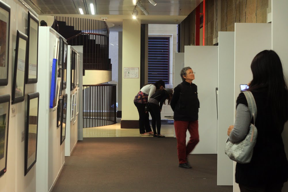
Artworks display section:

Computers section to provide access to info about the gallery, artists and artworks displayed:

Even a small library and reading area:


Public area where people can sit down to rest or read newspapers

Info desk to help providing details about what's going on in the gallery

Artworks display section:
Computers section to provide access to info about the gallery, artists and artworks displayed:

Even a small library and reading area:


Assignment 3: Sites
Newtown

Newtown is quite a prosperous and busy area. The main street is King street where there is high concentration of shops, restaurants and bus stops. I went there on a Sunday evening but it was (especially King street) packed with pedestrians and cars. Its location is quite convenient with public transport (buses, trains) available during weekdays and weekend.
SITE 1
Reasons I chose site 1:
1/ As was described in the assignment sheet, the client is a city art gallery owner and the site will comprise both his work place and living area. That's why site 1 is suitable because it front facade facing the crowded King street while the back facade facing the quiet Lennox street, suitable for growing a business but still allowing him to enjoy his personal spaces.
2/ The shape of the plan is long, narrow and restricted by buildings on both sides. This is rather a common scenario when building in cities and cosmopolitan areas. However, I think those disadvantages can somehow put my design into more practical perspectives rather than just aiming for look alone.
3/ There is a car park just right beside the site on Lennox street, convenient for customers to find parking and accessing the site given that Newtown is quite a crowded and busy cosmopolitan area.
4/ The park behind the site is a great location for families, groups and even individuals to come and enjoy themselves. Its a public area so it can attract people to the gallery. Its also a good place for the client and his family to hang out and relax after their working days.
Front view (on King street):

Back view (on Lennox street):


On King street:
Right (face facing the site)

Left (face facing the site)

On Lennox street:


Right (face facing the site)

Left (face facing the site)

The park:


The car park:


SITE 2
Site 2 is the biggest among 3 sites, exposing to 3 big streets and road (King street, Wilson street and Erskineville road). It has no surrounding buildings on 3 sides which makes it extremely easy to access.
Front view (on King street):

Side view (on Erskineville road):

Back view (on Wilson street):

On King street:
View opposite site

On Wilson street:
Right (face facing the site)

Left (face facing the site)

On Erskineville road:

SITE 3
This site is the busiest among 3 sites. It is so far my second favorite site because it locates right in the corner between many big streets (Eliza st, Wilson st and King st), close to train station and no doubt the easiest to recognize (its close to the corner so not getting swallowed by the infinite line of building after building like site 1). When considering about the practical aspect, I think site 3 can attract more attention from pedestrians. Plus, right next door is Zanzi bar which is a public place where people can sit down and have a drink together, making the site even more public exposed. However, the back of the site is blocked by buildings behind it, making the front facade the sole way to invite people coming in.
Front view (on King street):

On Wilson street:

On King street:
Left (face facing the site)

Right (face facing the site)

Subscribe to:
Posts (Atom)